Dear modertor


Dear Moderator,
I have made a music magazine for my coursework. I hope you enjoy looking through my work.
My planning and research starts from the 8th of September,
and my evaluation starts from the 24th of February. I hope you like my finished product, I will post a photo of my product below.
Amy!

Sunday, 30 October 2011

Research and planning: Costumes and Props.

Doc Martens are often seen worn my people who listen to and create rock music. You get these from the official Doc Marten website. A pair like these would cost you £95. In my magazine I want my models to be wearing shoes like these.

These Monkey Genes are from the Criminal Damage website. They're dark skinny jeans which are often related to rock music. These pair were £49 and I want these type of jeans in my magazine.

Checked shirts are great for wearing open over a band-tee. This shirt is from top man and was £117 but you can get checked shirts from everywhere and I think it will be perfect for my magazine.

This band-tee would be worn under the opened check shirt and is what lots of people who listen to rock wear. This is from pulp and cost £14.99
This is a Epiphone G-400 SG Style Electric Guitar,Cherry and costs £222. It would look great in my magazine as it sticks to the genre and stands out.

research and planning: double page spread analysis

Genre- The genre of this magazine is clear to the audience. It's a rock magazine. The colours and fonts show this and it's easy to see this as a reader. The black and white pictures tie in well with the three colour rule theme making this look even more like a rock double page spread. The image on this magazine also shows the genre. The band is wearing dark clothes to show the genre.
Target Audience- The target audience is clear in the spread. The page has been taken from a famous rock magazine and the page itself gives an obvious indication as to who it's aimed at. People who like rock music will want to read this, it would be the younger generations (age 15-25) and both male and female.
Layout- The layout of the page looks really good and is effective because it is eyecatching for the reader. The A4 picture on the left hand side draws the readers eye to the page. The red writing is also effective at getting the same effect. The writing looks short and easy to read, making it more appealing.
Representation- the A4 picture is obviously of the lead singer of the group. This picture gives him authority and his stage presence is known by the audience.
Media Language- The language is written is proper english and is very readable to the reader as Kerrang targets a teenage market therefore it has to be readable to that social group.

Overall i think this double page spread gives you a good indication of what the article will contain, it address the reader and will appeal to its target audience as it represents the conventions of a rock magazine well.

Thursday, 20 October 2011

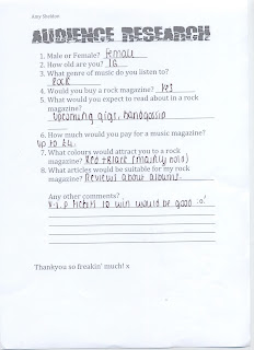
Research and planning: Questionaire results

I have made a questionnaires and gave it out to people in my class, I got people to fill them in, this will help me with my music magazine. Here is one of my questionnaires.

Thursday, 13 October 2011

Research and Planning: contents page analysis.

The genre of this magazine is rock. This is clear when looking at the contents page. The people on the pictures show this through there appearance. They generally wear rocky clothes and have long hair. The main picture on the page is of a man with long hair, stubble and a tattoo. He isn't smiling which also shows the genre. On my magazine, my picture is going to have people like this on the front cover. The target audience for this magazine is clear because of the colours, fonts, stories and people featured on the magazine. The colours of the magazine are white, black and yellow. This is consistent throughout the page and gives a clear genre.
The layout of this contents page is set out quite differently to some other magazines that you would associate with music; I would say that they have set out things quite quirky, even though there is still quite a structured layout with the four columns.
There is one main image, which would suggest that this is the main article in the magazine, i think this is what will attract most people. On the six main pictures on this page, all of the artists are made to look different. On two of the pictures the artists are singing, and both look like they are straining there voices, this shows that the music is loud making it appeal to the audience. Two other pictures have bands on them all stood together, having fun. This makes the audience want to know about their social life. The other two pictures are more moody pictures, both people in the pictures have attitude and this relates back to the rock genre.

Research and planning: Target Audience

My rock magazine is going to be aimed at people in there late teens, because they are my target audience, I'm going to make the magazine cheaper as most teenagers don't have much money.
It will be aimed at students in college or university and who come from a working class to middle class background, this will reflect on the price.
There is going to be a more dominant gender audience which is males, although this issue may appeal to females as well because of the male band on the cover.
The magazine will be aimed at people who are interested in rock music and artists, guitars, drums and other rock instruments, gigs and socializing with other readers of the magazine.
My audience can have different outlooks for their futures but, I think this will defiantly appeal to students studying music in university or uni students with not much money.
I'm going to reach my audience by advertising things they are interested in. Now I have my specific target audience, I can start to research what kind of things people may want to read about. I could involve colours that match with my audience eg. black, red, deep purple.

Friday, 7 October 2011

Planning & Research: Masthead

we was asked in lesson to create a masthead for our music magazine. I'm doing a rock magazine so I have chosen a font to go with my genre. I used a black font and placed red splashes around the text, In my research I found out that red and black were used mostly in rock magazines.

Thursday, 6 October 2011

Research and planning: Music magazine analysis

This is an example of a rock magazine. I chose this magazine to analyse because I think the layout looks really good and effective. I like how the magazine uses mid shots on the magazine and I think it is effective how the picture overlaps the masthead.
I think the font of the masthead is really good, it has the effect of it being smashed or cracked which looks good because it is a rock magazine.
The magazine follows the 3 colour rule which is good and the colours are appropriate for the genre.
I think this is a less effective magazine cover because the only thing letting you know the genre of the magazine is the person on it and if you didn't know who it was. I don't like how the masthead is just bold and white, I think it would have looked better if it was a different colour eg. black or red and I think it would have looked better in a different font. The magazine does follow the 3 colour rule though.